The Marina Barrage by Architects Team 3
The
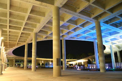
designers used horizontal and vertical lines all across the lower levels of the building, from precast floor beams being used upright as a wall, to horizontal lines across large bay doors, straight lines abound. If you never look up it is easy to forget that you are in a building that is in reality one large squiggly curve. When your on the ground floor, you will not be allowed to forget that you are in what is essentially an industrial space. The use of shallow fountain pools softens the harsh environment like little oasis in an unforgiving concrete desert.
Leaving the walls, ceilings and floors in what is essentially grey drab uniform concrete has allowed the designers to bath this blank
canvas in coloured lights at night The areas of high ceiling drag your eyes upward
towards the sweeping curves of the roof, and should u choose to leave the hard concrete industrial ground floor and walk up one of the gradual sloping walkways you will find yourself suddenly awash in colour. The deep greens of the grass, to the blue sky softened with white fluffy clouds during the day. At night the sky is an almost uniform black adorned with stars and closer to earth the brightly lit kites that seem to float unattached in the sky.
Its a bold building designed to create the 15
th reservoir in Singapore, but it is so much more than just that. Its a social space, people gather to play in the wading pools, sit and chat, fly kites or just
enjoy the city views. Within this ode to concrete clad in green there truly beats a living breathing heart.


I do like the fact that from certain areas on the ground floor you have these little glimpses of the new
buildings and structures that muscled their way into out skyline. These little glimpses hint at views that promise to impress.


The above is my favourite picture. It for some reason reminds me of the old Kallang Stadium.


Does it work? As with all buildings that strive to make a statement this one will hit some people in the right spots and others will want to throw their hands up and scream oh good god. For me it works. It shows that industrial buildings
don't just have to be that, they can be so much more. A social space, an almost artistic environment a somewhat socially retro place for people to fly their kites.
*forgive the typos, or not its up to you.


 The Marina Barrage by Architects Team 3


 I do like the fact that from certain areas on the ground floor you have these little glimpses of the new buildings and structures that muscled their way into out skyline. These little glimpses hint at views that promise to impress.


