Damn that was a long walk, skipped out of work at the half way point yesterday, went with TLOML to take the fatty to the vet...her first "red river"..we almost burst into tears when we realized that the river was rollin along.
 Our baby isnt a little girl anymore....sigh so quick.
Anyhow after the trip to the vet and the trip to the pet store, Sherwin and i took a train to the city and wandered the area between, Westin-the esplanade and marina square. I took 266 shots, suprised myself there cause i thought i wouldnt be doing much in the way of sh
 ooting so i didnt bring my tripod. We started off at the Cenotaph and though the lighting wasnt as good as we had hoped the stark clean cut white lines of the cenotaph were mighty impressive. I wonder how long its going to last there all by itself, the land it stands on must be worth a fair bit and i reckon that they will relocate it or build something that encompass it but they sure as hell aint gonna leave it there, this is singapore the land of the blocked facade.
  Once again i have wondered from the topic at hand. We went roaming the area and finally we ended back at the cenotaph and i took some shots without the use of the tripod so if its abit blur forgive me. My objective for our walk was to get some ideas and plan a good photography walk, in good light and
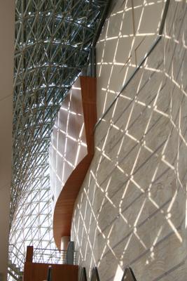
 ideal conditions such as not being so tired! but as they say..the best laid plans lead to ruin ..Once i started taking pics, i was looking for something specific in each shot, after the cenotaph i wanted to see if i could take shots with lines and curves in them or at least one of the two and while not every shot i took had these straight lines or curves most of them did.
  I found that after awhile i wasnt looking at how pretty everything looked but why it looked nice and how it worked in the larger frame of things.
  This lead me to find the interior of the esplanade where i took most of my 266 shots a beautifully structed and well designed building. While i will be the first to admit the exterior of the building leaves alot too be desired(to me at least) the interior does have many qualities worth noting. Lines and curves seem to be all over the place here even in things which i would not have paid much attention to(such as the railings) any other time i visted the building.
 For such a modern building it has a very appealing sense of colonial architecture, with the clean lines and uncluttered feel of the place.
  We met Frodo at the roof terrace of the esplande, its a nice setting very nice for a stroll for those going on a first date, u get the feeling of wealth while not having to pay for it, almost like walking through The Fullerton Hotel.
  All in all it was a nice evening, we had a little bit to eat at Marina Square, strolled back to the Cenotaph and departed from the Grand Hotel around midnight, good clean cheap healthy fun. what more could a man ask for i say.
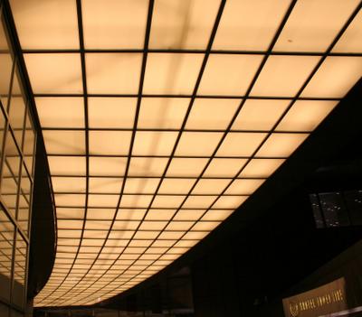
The pics i loaded are not really good shots but they maintain the theme throughout and thats why i loaded these instead of some of the others i could have loaded. The shot that looks like something from the billy jean video, only on the ceiling, is from suntec city another place that i think would take a couple of hours walk around over a couple of weeks for us to be satisfied with.

SIDEBAR-PICS ARE CROPPED AND RESIZED(SMALLER) AND IF YOU NOTICE A TYPO GET IN LINE.
MY last shot is of course a HMMM shot and it doesnt fit into the theme but, i am a fool for flowers so tough luck.

No comments:
Post a Comment